External Links
-
Open Prototype - https://embed.figma.com/proto/dJgsXGf3LhAJuVZAnJyLqh/Dominos-Redesign-Main-File?node-id=108-916&p=f&scaling=scale-down&content-scaling=fixed&page-id=1%3A2&starting-point-node-id=108%3A914&embed-host=share
2025
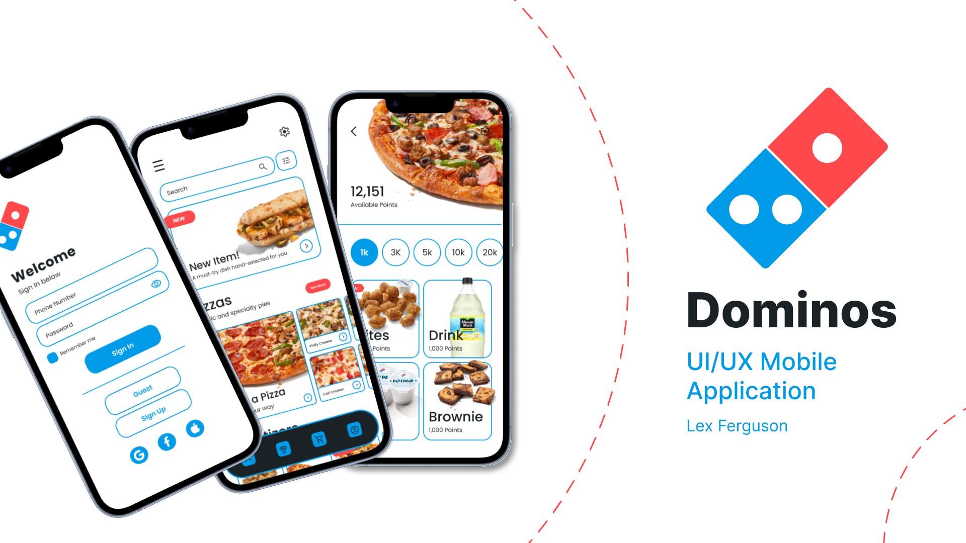
A two-and-a-half-week mobile app redesign that reduced Domino's core ordering journey from roughly 14 screens to a clearer five-screen flow.
I redesigned Domino's mobile app independently as the final project for my third-year Graphic Design Studio II course. Working within a two-and-a-half-week deadline, I took the project from research and app audit through user persona planning, empathy mapping, pain-point analysis, competitor review, moodboarding, visual direction, user flows, wireframes, high-fidelity UI, and presentation prototype. The original experience felt outdated and made ordering feel longer than it needed to be, with cluttered content, confusing navigation, and important menu and account actions buried behind extra steps. I restructured the core journey from roughly 14 screens into a focused five-screen flow covering entry and order settings, menu browsing, item customization, cart review, and checkout. I preserved recognizable Domino's brand cues while adapting the existing feature set into a lighter interface with clearer hierarchy, updated typography and color, more intentional components, and a stronger mobile design system. I owned the full project and used critique from classmates and professors to refine the flow and visual decisions throughout. The result is a complete product-design concept that demonstrates research-to-prototype thinking, information architecture, brand adaptation, and the ability to make a familiar but dated experience feel faster and more coherent under a tight scope.
Tools: Figma
01 Image
Dominos redesign preview