External Links
No public external links are attached to this project.
2024
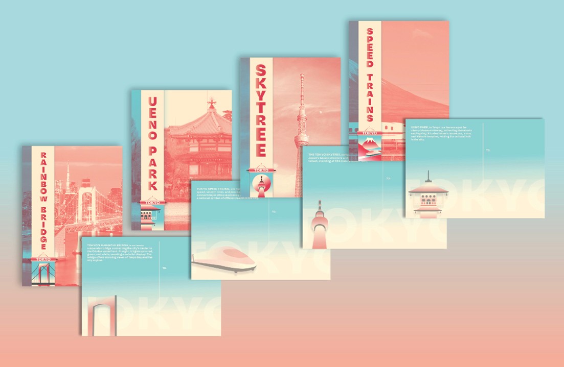
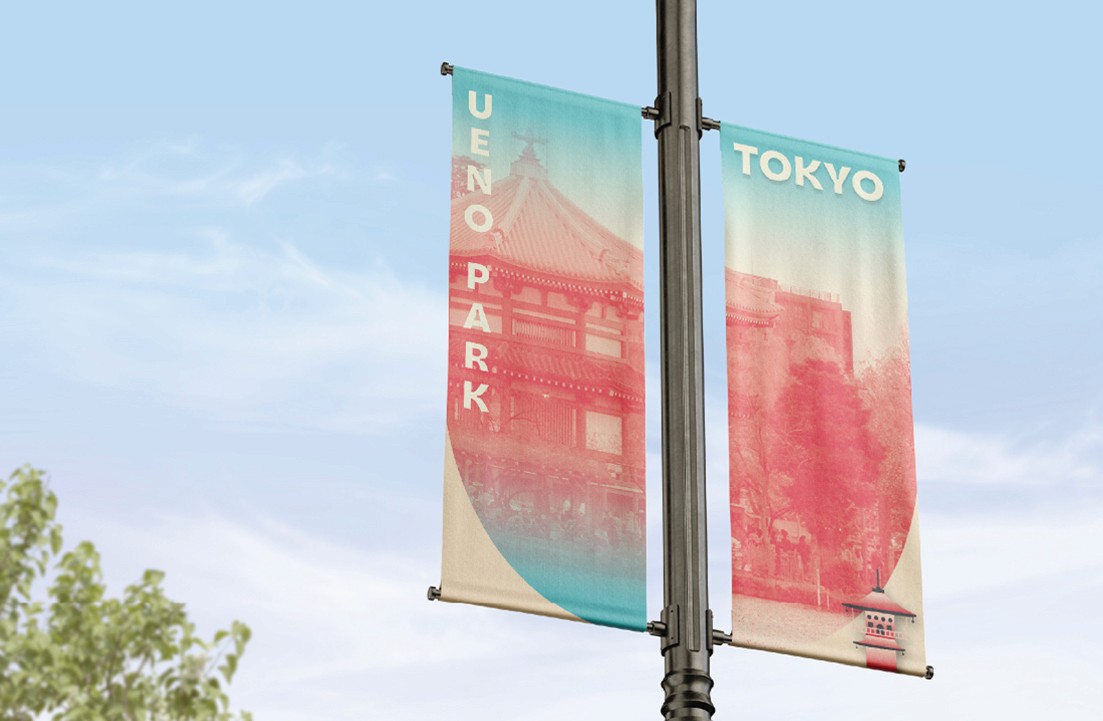
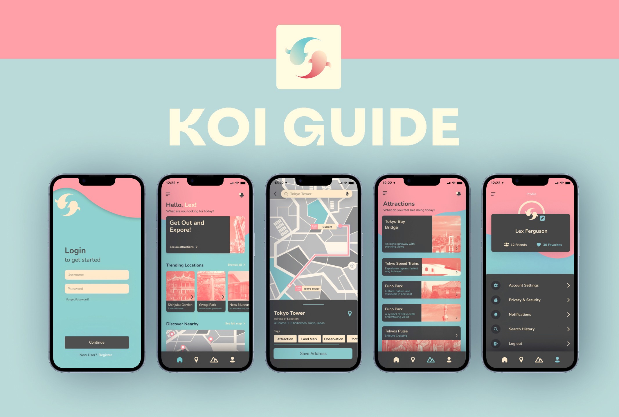
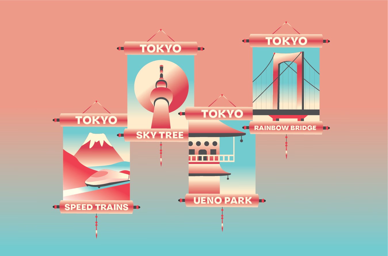
A Tokyo-inspired identity and wayfinding project built through badges, UI, banners, and postcards.
City Scapes is a city-identity and wayfinding concept built around Tokyo as the source context. I designed a cohesive system across badges, banners, postcards, and a supporting UI wayfinding concept. The project focused on balancing visual character with practical navigation cues. I used Illustrator and Figma to keep brand expression and interface behavior aligned. The outcome was a multi-surface identity system that feels atmospheric while still functionally clear.
Tools: Illustrator, Figma
No public external links are attached to this project.
01 Image
City Scapes thumbnail
https://aferguson.art/images/projects/city-scapes/thumbnail.jpg
02 Image
City Scapes gallery image one
https://aferguson.art/images/projects/city-scapes/gallery-1.jpg
03 Image
City Scapes gallery image two
https://aferguson.art/images/projects/city-scapes/gallery-2.jpg
04 Image
City Scapes gallery image three
https://aferguson.art/images/projects/city-scapes/gallery-3.jpg